Data Intellect
Introduction
Welcome to the third instalment in our KDB.AI series. Previously, we developed a support bot for TorQ users (TESS). Then we demonstrated the basic functionality of KDB.AI.search, and its application to anomaly detection. Today we will explore how we can leverage KDB.AI in the analysis of financial market data.
Pattern matching is a branch of time series analysis that looks at the occurrence of patterns (or sequences) in a time series. In financial trade data, large and small-scale patterns can indicate trends or behaviours of financial assets. These insights are useful for investors, as they can indicate the volatility or risk associated with certain assets, as well as their reactivity to economic or political events. Pattern matching is made very easy with KDB.AI; you can produce sound insights using this methodology straight out of the box, with capacity for scale and more complex analyses as required. Today we will demonstrate some creative ways of using KDB.AI to analyse patterns in financial time series data.
Eyes on the Prize
Before undertaking any kind of analysis, it is necessary to consider the questions you want to answer, for these will determine how you will prepare your data. As we demonstrated previously, KDB.AI stores market data in the form of “windows” which contain a subsequence of a time series. We can configure the window size (for example, 1 day, 1 week or 5 weeks), as well as the step size between these windows, to capture different patterns in the data. We will show you how modifying these windows will enable us to address the questions we have in mind.
The data
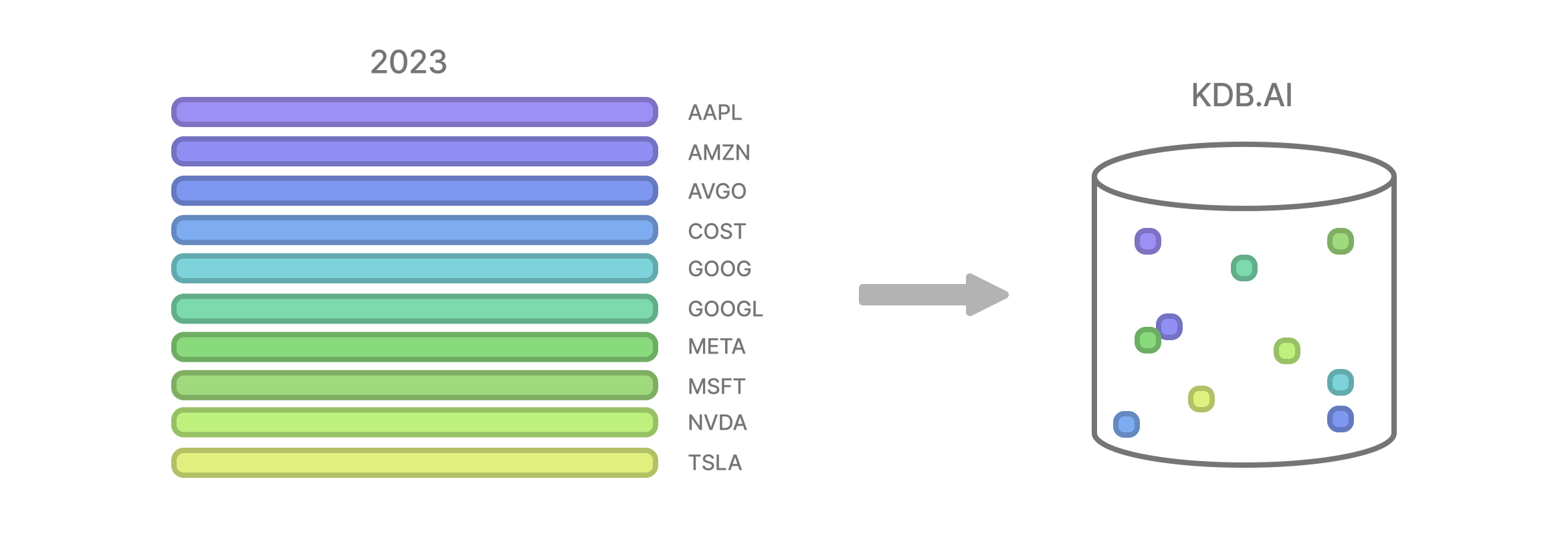
Today we will analyse market data for the top 10 stocks on the NASDAQ-100, from the past five years. Specifically, we will look at how the weekly high price of each of these assets changed across the time series. We obtained weekly OHLC market data from DevAPI using their free API service. You can sign up and try it for yourself here.
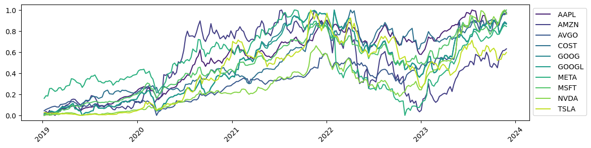
Fig 1. Time series of weekly OHLC data for 10 NASDAQ syms, values are normalised high prices.
Part 1: The Highs and Lows
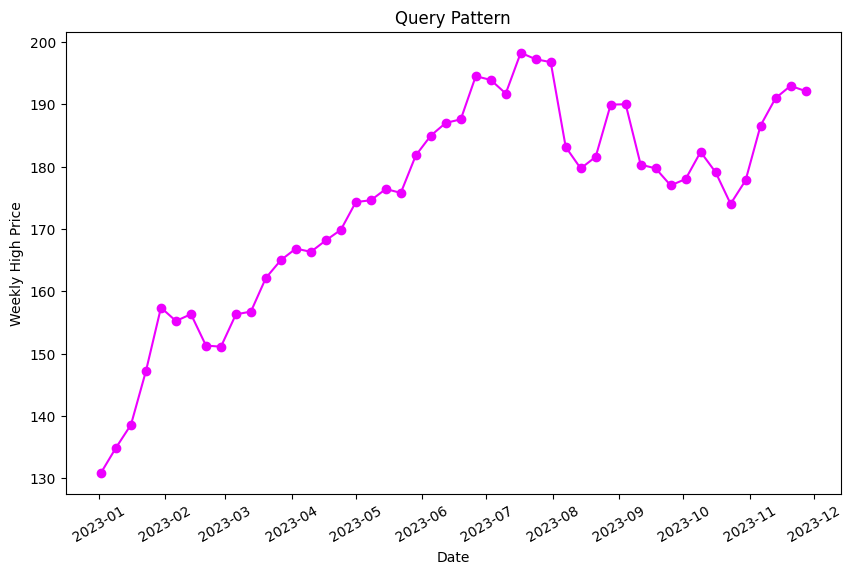
Exploring market reactions to key events often unveils intriguing business trends and behaviours in the market. Earlier this year, Apple’s highly anticipated unveiling of a virtual reality headset led to a staggering surge in their stock prices, such that they hit an all-time high that week. We wanted to know if this was truly unprecedented for Apple. So, our first question in this analysis was:
Q1 – “Have we seen this pattern before in Apple stocks?”
For our first analysis, we will search for a specific pattern in the Apple stock timeseries. To create our vector embeddings, we will split the Apple timeseries data into three month windows (window size: 12) with a six week overlap (step size: 6), to capture patterns in the price of AAPL stock. We will also normalise the data to help with the analysis later.
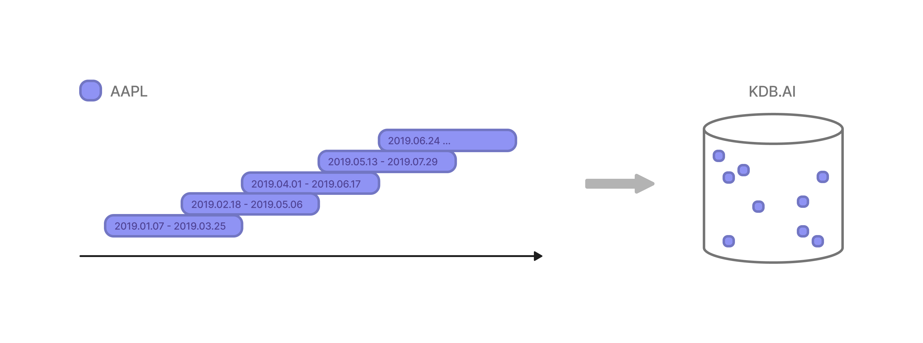
The resulting windows are defined by a startDate, endDate and the vectors within the subsequence.
| startDate | endDate | vectors |
| 2019-01-07 | 2019-03-25 | [0.0, 0.0052631578947368194, 0.005639097744360… |
| 2019-02-18 | 2019-05-06 | [0.029448621553884686, 0.033458646616541333, 0… |
| 2019-04-01 | 2019-06-17 | [0.06672932330827067, 0.0756892230576441, 0.07… |
| 2019-05-13 | 2019-07-29 | [0.059461152882205486, 0.052443609022556376, 0… |
| 2019-06-24 | 2019-09-09 | [0.07368421052631578, 0.07919799498746868, 0.0… |
| … | … | … |
| 2023-02-27 | 2023-05-15 | [0.7047619047619049, 0.7372807017543861, 0.740… |
| 2023-04-10 | 2023-06-26 | [0.800062656641604, 0.8115914786967419, 0.8221… |
| 2023-05-22 | 2023-08-07 | [0.8592731829573936, 0.8969298245614036, 0.916… |
| 2023-07-03 | 2023-09-18 | [0.9727443609022557, 0.9590852130325814, 1.0, … |
| 2023-08-14 | 2023-10-30 | [0.8838345864661654, 0.8954887218045114, 0.947… |
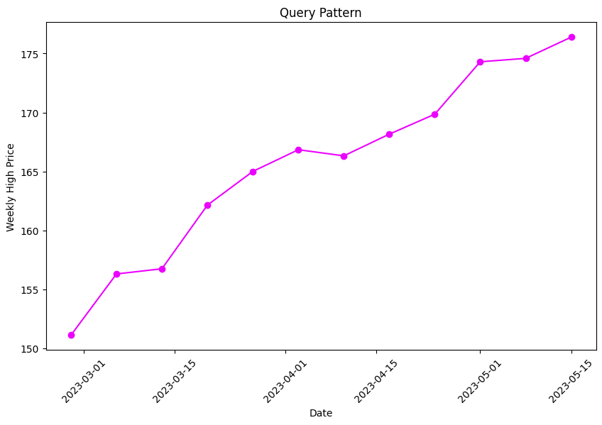
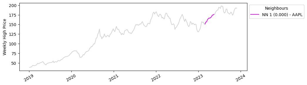
Our query pattern is a three month subsequence of our data running from 24th April 2023 to 10th August 2023. This should capture those soaring Apple stock prices we discussed earlier.
Now, let’s run the query.
# search for 5 nearest neighbours based on query sequence
table.search(query_vector, n=5)
Results
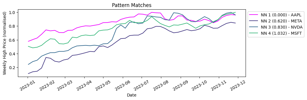
Below are the 5 most similar sequences to our query vector, with the nearest neighbour distance (nn) given in brackets. NN1 is the query vector itself, so the match is exact.
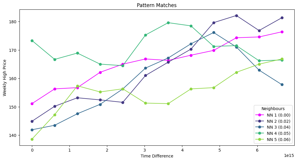
When we plot these on the Apple timeseries, we can see that similar rises in Apple stock prices have occurred in the past couple of years. Using this information, we could investigate whether these patterns are associated with specific events like product releases or economic events.
Part 2: Scaling up
It’s time to cast our net a little wider, and consider multiple different timeseries in our analysis. With KDB.AI, this involves a simple change in how we embed the data.
Q2 – “Have we seen this pattern before in the top NASDAQ stocks?”
For our second analysis, we will perform our search query across multiple time series. To make this happen, we will slice each timeseries into windows as before and store them all together in our vector database.
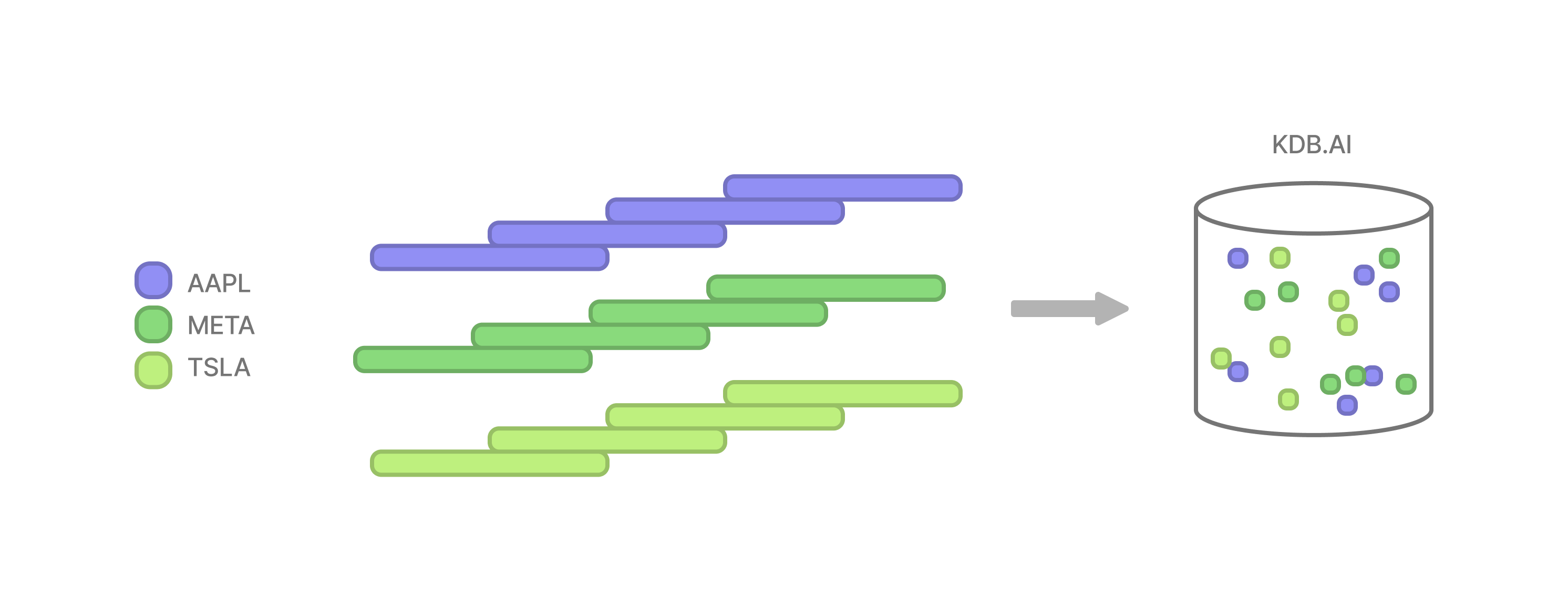
The only difference to our embeddings is the addition of an enumerated “sym” column, which will denote the timeseries that each window belongs to. Our query pattern remains the same.
| sym | startDate | endDate | vectors |
| 0 | 2019-01-07 | 2019-03-25 | [0.0, 0.0052631578947368194, 0.005639097744360… |
| 0 | 2019-02-18 | 2019-05-06 | [0.029448621553884686, 0.033458646616541333, 0… |
| 0 | 2019-04-01 | 2019-06-17 | [0.06672932330827067, 0.0756892230576441, 0.07… |
| 0 | 2019-05-13 | 2019-07-29 | [0.059461152882205486, 0.052443609022556376, 0… |
| 0 | 2019-06-24 | 2019-09-09 | [0.07368421052631578, 0.07919799498746868, 0.0… |
| … | … | … | … |
| 9 | 2023-02-27 | 2023-05-15 | [0.49372353673723535, 0.462266500622665, 0.431… |
| 9 | 2023-04-10 | 2023-06-26 | [0.4447820672478207, 0.4400747198007472, 0.380… |
| 9 | 2023-05-22 | 2023-08-07 | [0.462266500622665, 0.5087173100871731, 0.5963… |
| 9 | 2023-07-03 | 2023-09-18 | [0.6755915317559154, 0.6782067247820672, 0.713… |
| 9 | 2023-08-14 | 2023-10-30 | [0.5670236612702366, 0.5674221668742216, 0.618… |
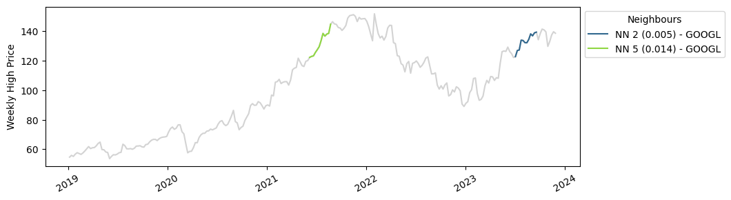
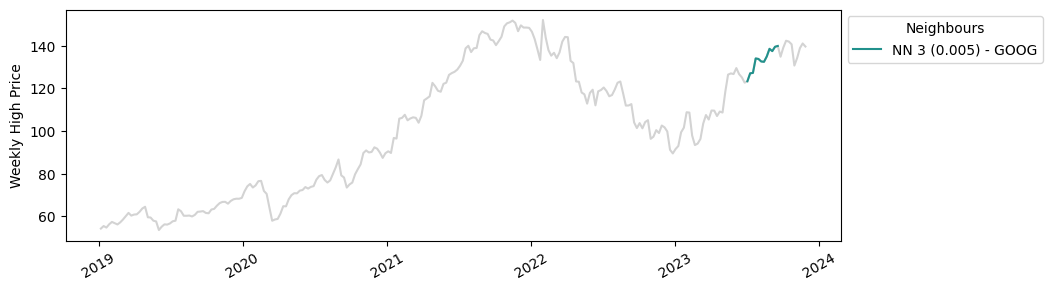
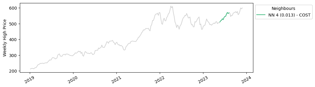
Results
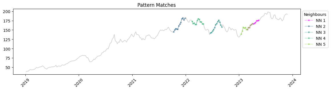
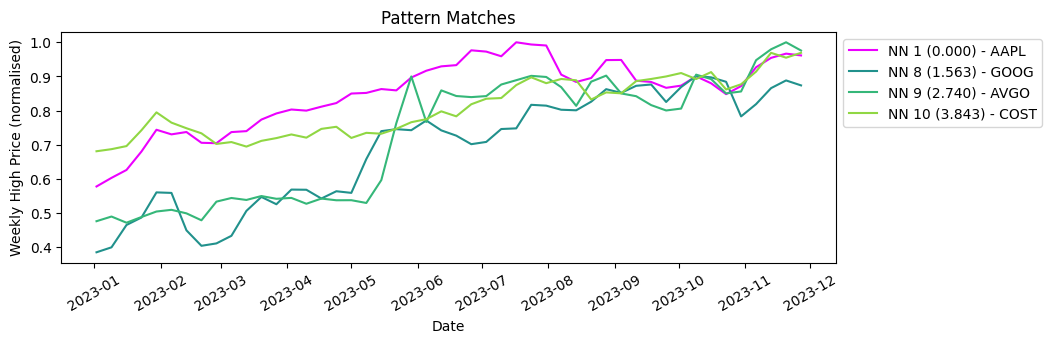
This time when we run the query, we are searching for the five nearest neighbours to our query vector, across ten different timeseries.
# search for 5 nearest neighbours based on query sequence
table.search(query_vector, n=5)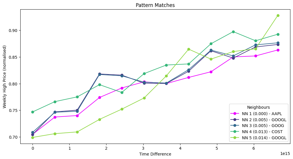
The matches we found are much closer in distance to our query vector, which makes sense because we have a much larger sample number. With KDB.AI, we’ve just scaled up our analysis tenfold with minimal effort. Below we can see where these matches are plotted in their individual time series. Apple, Google and Costco have all seen similar increases in stock prices this year!
Part 3: The big picture
Now let’s zoom out a little. What if we wanted to compare the market performance of our ten NASDAQ stocks across a larger timeseries? As before, this can be achieved by reframing our data a little.
Q3 – “How did the market performance of the NASDAQ stocks compare to Apple in 2023?”
Instead of having multiple overlapping windows, we will store each full time series as a single vector embedding. This simple change will enable us to compare entire time series with one another.
Our query pattern for this analysis is the Apple stock market data for the entire year of 2023.
As before, we run our search function. This time we will search for the three closest sequences to our query vector (so four including our query vector itself).
table.search(query_vector, n=4)Results
Comparative market analysis made simple, you can see below that Meta, Nvidia and Microsoft performed most similarly to Apple in 2023.
Finding our 3 most dissimilar time series is a simple extension. We calculate the distances of each timeseries to the Apple timeseries, which gives us a list of windows ordered by distance from the query vector. We then just take the bottom three.
result = table.search(query_vector, n=10)
last = result[0].iloc[[7,8,9]]Here they are plotted with our query vector.
Mise en Place
Today we’ve demonstrated three different ways of analysing market data trends with KDB.AI. At its core, all that differentiated these analyses was data preparation, the boundaries of the vector embeddings can be changed to encompass individual events, groups, or even entire time series. Once stored we can analyse their similarity to existing vectors, or new ones, to provide new insights into our data. This approach to pattern matching is quite flexible, and enables users to be creative with how they approach their analysis in KDB.AI.
Here at Data Intellect, we are always exploring new technologies and methods to power data analyses. Watch this space as we continue to explore what KDB.AI has to offer.
Share this: