Data Intellect
Introduction
Welcome to the second instalment in our series covering KX’s latest product, KDB.AI. Our previous blog explored how we can query unstructured text data by making use of natural language processing (NLP). Today, we will demonstrate a simple anomaly detection analysis on structured timeseries data with KDB.AI.
Anomaly detection with timeseries data
When data fluctuate over time, like sensor readings, stock prices or weather data, they are defined as a timeseries. The careful analysis of these data can yield powerful insights on historical business/system performance, predicted future outcomes and the underlying causes of trends or systemic patterns over time. Pattern matching is a widely used tool which involves searching for a specific pattern (or sub-sequence) in a larger timeseries dataset.
Anomalies are events that deviate significantly from expected behaviour in a dataset. In a timeseries, anomalous patterns might include unusual or fraudulent trading activities, or faults in a manufacturing system. Anomaly detection in timeseries data has wide applications in cyber security, financial regulation and systems monitoring. Pattern matching is a relatively simple, but effective method of anomaly detection, where a subsequence of known anomalous behaviour is used to search for similar patterns in a timeseries dataset.
Fig 1. Pattern matching enables us to detect or predict unusual patterns or system anomalies (indicated by the red dots) in a timeseries dataset.
Anomaly detection with KDB.AI
Typical pattern matching involves the comparison of a query sequence stepwise across the entire timeseries, which returns a list of nearest neighbours. With KDB.AI, we can perform the analysis a little differently than with standard approaches.
In a KDB.AI database, data are stored as vector embeddings, which can be queried to find approximate nearest neighbours to a given query vector. In the case of our timeseries data, each data point in the database will consist of a “window” or subsequence of the timeseries, and the values are used to create the vector embeddings. When we insert the data, KDB.AI calculates each embedding’s similarity to the others and stores them in the vector space accordingly, i.e. similar patterns are stored together more closely in the vector space than dissimilar patterns. Once stored, we can compare every window in the timeseries with a query subsequence, bypassing the stepwise approaches of traditional methods of pattern matching by making use of the intrinsic functionality of KDB.AI.
Let’s jump into a straightforward example to demonstrate how anomaly detection works in KDB.AI, and how it compares with a traditional pattern matching method.
Hands-on - Pattern matching with KDB.AI
We will be using a dataset composed of sensor values from a system that experienced anomalies. The dataset is available at the following URL [link], and contains 46623 records of 8 sensor values, recorded once per second. There is also a column indicating whether the system is experiencing an anomaly at that timepoint.
1. Prepare the workspace
Load the required packages
import kaggle
import pandas as pd
import matplotlib.pyplot as plot
import kdbai_client as kdbai
from getpass import getpass
import datetimeLoad the data
Let’s first do some preparation on the dataset to clean it up. We will remove duplicates, drop irrelevant columns and handle missing data. This dataset has 8 sensor columns – for this analysis we will be looking at the “Volume Flow RateRMS”.
df = pd.read_csv("alldata_skab.csv")

df = df.drop_duplicates()  # Drop duplicates
df = df.dropna(subset=['anomaly']) # Drop NA values in anomaly column
df["datetime"] = pd.to_datetime(df["datetime"]) # Type conversions, object to datetime
broken = df[df["anomaly"] == 1.0] # Extract anomalous readings from the system
df1 = df[["datetime", "Volume Flow RateRMS"]] # Extract the names of the numerical columns

# Plot time series for each sensor with anomalous points
plot.figure(figsize=(25, 3))
plot.plot(broken["Volume Flow RateRMS"], linestyle="none", marker="o", color="lightgrey", alpha= 0.8, markersize=6)
plot.plot(df["Volume Flow RateRMS"], color="grey")
plot.show()
Fig 2. Time series of “Volume Flow RateRMS” with anomalous readings shaded in grey

2. Create vector embeddings
As I mentioned before, creating the vector embeddings for our timeseries is a simple task which leverages the sensor readings directly. First, we will divide the data into a series of sliding “windows”, which will allow us to capture each sub-sequence in the timeseries. The window size refers to the number of sensor readings, or the size of the sub-sequence, and the step size enables us to configure the amount of overlap between each subsequence. The data will then be normalised to help with the pattern match analysis. The final data frame is saved as result_df.
Fig 3 . By creating sliding windows, we can capture patterns in our timeseries data.
# Set the window size (number of rows in each window)
window_size = 30
step_size = 10

# Initialize empty lists to store results
start_times = []
end_times = []
vfr_values = []

# Iterate through the DataFrame with the specified step size
for i in range(0, len(df) - window_size + 1, step_size):
    window = df.iloc[i : i + window_size]
    start_time = window["datetime"].iloc[0]
    end_time = window["datetime"].iloc[-1]
    values_in_window = window["Volume Flow RateRMS"].tolist()
    start_times.append(start_time)
    end_times.append(end_time)
    vfr_values.append(values_in_window)

# Create a new DataFrame from the collected data
result_data = {"startTime": start_times, "endTime": end_times, "vectors": vfr_values}
result_df = pd.DataFrame(result_data)

# Find the minimum and maximum values for the entire DataFrame
min_value = result_df["vectors"].apply(min).min()
max_value = result_df["vectors"].apply(max).max()

# Normalize the "vectors" column
result_df["vectors"] = result_df["vectors"].apply(
    lambda x: [(v - min_value) / (max_value - min_value) for v in x]
)

# Print the resulting DataFrame
print(result_df)3. Store embeddings in KDB.AI vector database
Connect to KDB.AI cloud instance
Sign up for your own session here.
KDBAI_ENDPOINT = input('KDB.AI endpoint: ')
KDBAI_API_KEY = getpass('KDB.AI API key: ')
session = kdbai.Session(api_key=KDBAI_API_KEY, endpoint=KDBAI_ENDPOINT)Define table schema
Next, we define a relatively simple schema for our timeseries data. Each data point is a subsequence defined by a start time, an end time and the vector embeddings. Note that here is where we specify the indexing method for our vector database, the Hierarchical Navigable Small World (HNSW) method, and the similarity method, here Euclidean distance (L2). Using the schema, we then create the table and insert the data.
sensor_schema = {
    "columns": [
        {
            "name": "startTime",
            "pytype": "datetime64[ns]",
        },
        {
            "name": "endTime",
            "pytype": "datetime64[ns]",
        },
        {
            "name": "vectors",
            "vectorIndex": {"dims": window_size, "metric": "L2", "type": "hnsw"},
        },
    ]
}


table1 = session.create_table("sensor", sensor_schema)
table1.insert(result_df)
table1.query()| startTime | endTime | vectors | |
| 0 | 2020-02-08 16:06:48 | 2020-02-08 16:07:19 | [0.9473456846986891, 0.9446866793325459, 0.947… |
| 1 | 2020-02-08 16:06:59 | 2020-02-08 16:07:29 | [0.9396240532964427, 0.9497643279978364, 0.944… |
| 2 | 2020-02-08 16:07:09 | 2020-02-08 16:07:40 | [0.9422530134042114, 0.9473456846986891, 0.954… |
| 3 | 2020-02-08 16:07:20 | 2020-02-08 16:07:50 | [0.9497643279978364, 0.9446866793325459, 0.947… |
| 4 | 2020-02-08 16:07:30 | 2020-02-08 16:08:01 | [0.9422530134042114, 0.9422530134042114, 0.942… |
| … | … | … | … |
| 3701 | 2020-03-09 17:12:53 | 2020-03-09 17:13:24 | [0.2358604460242642, 0.2290168872980125, 0.236… |
| 3702 | 2020-03-09 17:13:04 | 2020-03-09 17:13:35 | [0.2358604460242642, 0.22936616342661606, 0.24… |
| 3703 | 2020-03-09 17:13:15 | 2020-03-09 17:13:45 | [0.23618944160346497, 0.23618944160346497, 0.2… |
| 3704 | 2020-03-09 17:13:25 | 2020-03-09 17:13:56 | [0.23618944160346497, 0.2358604460242642, 0.22… |
| 3705 | 2020-03-09 17:13:36 | 2020-03-09 17:14:07 | [0.24337176061788918, 0.23618944160346497, 0.2… |
4. Anomaly detection with KDB.AI
Now we have our timeseries data stored in KDB.AI, we can perform a pattern match analysis using KDB.AI search. As I mentioned before, we will query the vector database with a subsequence matching the format of our data (i.e. a window with a start time, end time and vector embeddings). In this example, we will do this by selecting a window from our dataset containing an anomalous pattern, however we could also define a completely new window and use that instead.
First, we get a timestamp containing a record of an anomaly, and then we search for a window’s start time closest to that value.
# Get timestamp of anomalous reading
anom = pd.Timestamp('2020-03-01 17:20:39')

# Create copy of result_df with startTime as index
result_id = result_df.set_index('startTime')

# Search for closest index to anom timestamp
closest_index = (result_id.index.get_loc(anom, method='nearest'))
idx = result_df.index[closest_index+1]

# Get startTime of window closest to anom timestamp
anomTime= result_df.iloc[idx]['startTime']

# Filter result_df based on the specific startTime
query_vector = result_df[result_df["startTime"] == anomTime][
    "vectors"
].values.tolist()

# Select query pattern as dataframe for visualisation
df_query_times = result_df[result_df["startTime"] == anomTime]
Q_df = df[(df["datetime"] >= df_query_times.iloc[0]["startTime"]) & (df["datetime"] <= df_query_times.iloc[0]["endTime"])]

# Create a line plot
plot.figure(figsize=(15, 6))
plot.plot(Q_df["datetime"], Q_df["Volume Flow RateRMS"], color = "grey", marker="o", linestyle="-")
plot.xlabel("datetime")
plot.ylabel("Value")
plot.title("Query Pattern")
plot.grid(False)
plot.xticks(rotation=45)
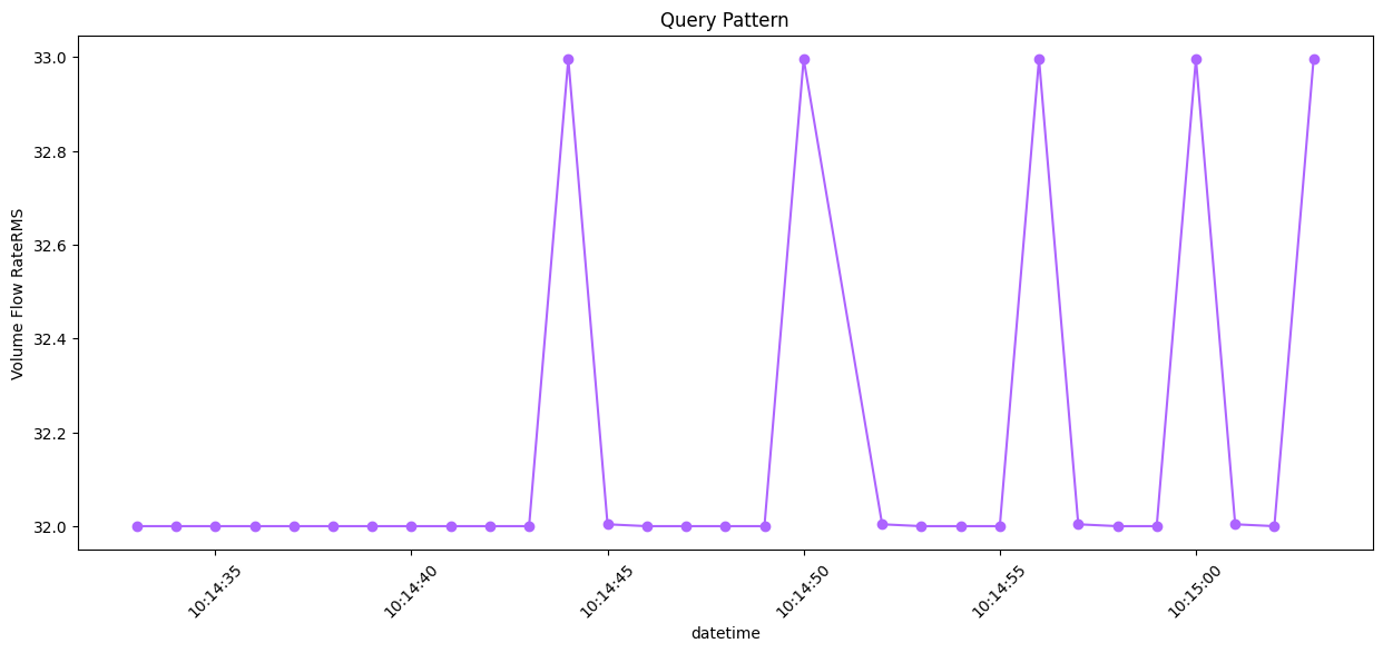
Fig 4. Query subsequence capturing a system anomaly in the timeseries
We will then make use of KDB.AI’s search function to find the five nearest neighbours in the timeseries. This will output a table with the details of the top five nearest neighbours and the nn distances. Since we are using an existing window for our query, NN1 is the query vector itself.
result = table1.search(query_vector, n=5)| startTime | endTime | vectors | __nn_distance | |
| 0 | 2020-03-09 10:14:33 | 2020-03-09 10:15:03 | [0.23618944160346497, 0.23618944160346497, 0.2… | 0.000000 |
| 1 | 2020-03-09 10:35:39 | 2020-03-09 10:36:10 | [0.23618944160346497, 0.23618944160346497, 0.2… | 0.000168 |
| 2 | 2020-03-09 16:54:26 | 2020-03-09 16:54:57 | [0.23618944160346497, 0.23618944160346497, 0.2… | 0.000173 |
| 3 | 2020-03-09 12:23:54 | 2020-03-09 12:24:25 | [0.2362750705898323, 0.23618944160346497, 0.23… | 0.000222 |
| 4 | 2020-03-09 13:55:52 | 2020-03-09 13:56:23 | [0.23618944160346497, 0.23618944160346497, 0.2… | 0.000222 |
Visualise results
A quick inspection of the results clearly demonstrates the ability of KDB.AI’s search function to detect system anomalies.
df1 = df
df2 = result[0]
df2

# Create a list to store the results
result_list = []
# Initialize label counter
label_counter = 1

# Iterate through the rows of df2 to filter df1 and calculate time differences
for index, row in df2.iterrows():
    mask = (df1["datetime"] >= row["startTime"]) & (df1["datetime"] <= row["endTime"])
    filtered_df = df1[mask].copy()  # Create a copy of the filtered DataFrame
    filtered_df["time_difference"] = filtered_df["datetime"] - row["startTime"]
    filtered_df["pattern"] = label_counter
    label_counter += 1  # Increment the label counter
    result_list.append(filtered_df)

# Concatenate the results into a new DataFrame
result_df2 = pd.concat(result_list)

# Group by 'label_counter' and plot each group separately with a legend
groups = result_df2.groupby("pattern")
fig, ax = plot.subplots(figsize=(15, 6))

colourlist = ["#AD64FF", "#C2E9FD", "#9BBEC8", "#427D9D", "#164863"]
ccounter=0
for name, group in groups:
    ax.plot(
        group["time_difference"], group["Volume Flow RateRMS"], color = colourlist[ccounter], marker="o", label=f"NN {name}"
    )
    ccounter +=1

ax.set_xlabel("Time Difference")
ax.set_ylabel("Volume Flow RateRMS")
ax.legend(title="Neighbors")
plot.title("KDBAI Pattern Matches")
plot.grid(False)
plot.show()
Fig 5. Query subsequence (NN1) overlaid with 4 nearest neighbours in the timeseries (KDBAI)
We can also plot where those matches are located in the timeseries.
q_res = result[0]
result_list1 = {}
label_counter1=1
df2 = df[['datetime','Volume Flow RateRMS']]

for i in q_res.index:
    mask = (df2['datetime'] >= q_res.loc[i]['startTime']) & (df2['datetime'] <= q_res.loc[i]['endTime'])
    res = df2.loc[mask]
    result_list1[label_counter1] = pd.DataFrame(res)
    label_counter1 +=1

result_list1
colourlist = ["#AD64FF", "#C2E9FD", "#9BBEC8", "#427D9D", "#164863"]
ccounter=0

plot.figure(figsize=(25, 3))
plot.plot(broken["Volume Flow RateRMS"], linestyle="none", marker="o", color="#F1F1F1", markersize=12, alpha=0.1)
plot.plot(df["Volume Flow RateRMS"], color="grey", alpha = 0.5)

for j in range(1,1+ len(q_res)):
    plot.plot(result_list1[j]["Volume Flow RateRMS"], color = colourlist[ccounter], linewidth=6.0, label=f"NN {j}")
    ccounter +=1
plot.legend()
plot.show()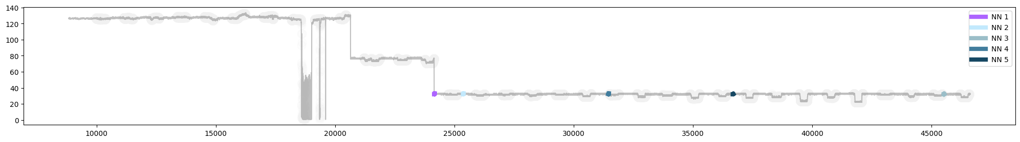
Fig 6. Plot of query subsequence (NN1) with 4 nearest neighbours in the timeseries (KDBAI)
So now you have seen how we can detect anomalies in a timeseries using KDB.AI. Depending on the questions we have, we can make decisions on embedding and similarity methods, as well as the window sizes and degree of overlap. Adjusting these variables enables us to refine and optimise KDB.AI’s similarity search functionality.
Next, let’s see how KDB.AI compares with a traditional approach to anomaly detection.
Hands-on - Traditional pattern matching with Stumpy MASS
For the second part of our hands on, we will use a nifty python package known as STUMPY. We can employ an efficient approach called “Mueen’s Algorithm for Similarity Search” (MASS) that will scan along the length of our timeseries with a fixed window size, measuring the distance between our query subsequence and every other subsequence in the dataset.
We will use MASS to search for system anomalies using the same subsequence we used previously.
1. Prepare the workspace
Load the required packages
import pandas as pd
import stumpy
import numpy as np
import numpy.testing as npt
import matplotlib.pyplot as plot
from matplotlib.patches import Rectangle

plt.style.use('https://raw.githubusercontent.com/TDAmeritrade/stumpy/main/docs/stumpy.mplstyle')Define the query subsequence
Previously, we defined a data frame containing the query subsequence for visualisation purposes (Q_df). We will use it as our query sequence in this analysis.
2. Run Stumpy MATCH
Running the analysis is a straightforward process, requiring only a few lines of code. We set the “window size” (m) as the length of the query subsequence. One benefit of using stumpy.match is that as it discovers each new neighbour, it applies an exclusion zone around it, ensuring that each match is a unique occurrence. For this analysis we maintained the default parameter for the exclusion zone.
m = Q_df["Volume Flow RateRMS"].size

stumpy_matches = stumpy.match(
    Q_df["Volume Flow RateRMS"],
    df["Volume Flow RateRMS"],
    max_distance=np.inf,
    max_matches=5,      # find the top 5 matches
)MASS will output a 2D array detailing the starting index of each match and the nn distance from the query sequence. Because mass uses a sliding window comparison, the top match won’t match the query sequence exactly (like with KDB.AI where we compared predefined windows), but it is pretty close.
| NN distance | Match index | |
| NN1 | 1.22e-05 | 14610 |
| NN2 | 3.80 | 22260 |
| NN3 | 3.89 | 22101 |
| NN4 | 3.88 | 33937 |
| NN5 | 3.94 | 25712 |
Visualise results
The MASS approach has successfully detected system anomalies in our timeseries.
# Since MASS computes z-normalized Euclidean distances, we should z-normalize our subsequences before plotting
Q_z_norm = stumpy.core.z_norm(Q_df['Volume Flow RateRMS'].values)

import matplotlib.pyplot as plot

fig, ax = plot.subplots(figsize=(15, 6))

colourlist = ["#C2E9FD", "#9BBEC8", "#427D9D", "#164863", '#0E364C']
ccounter= 0
lcounter = 1

plt.suptitle('MASS Pattern Matches')
plt.xlabel('Time', fontsize ='20')
plt.ylabel('Volume Flow RateRMS')

for match_distance, match_idx in stumpy_matches:
    match_z_norm = stumpy.core.z_norm(df2['Volume Flow RateRMS'].values[match_idx:match_idx+len(Q_df)])
    plt.plot(match_z_norm, lw=2, color = colourlist[ccounter], label=f"NN {lcounter}")
    ccounter +=1
    lcounter +=1

plt.plot(Q_z_norm, lw=2, color="#AD64FF", label="Q seq")
plt.legend()
plt.show()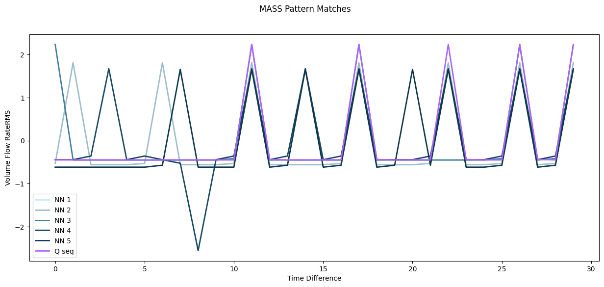
Fig 7. Query subsequence (Q seq) overlaid with 5 nearest neighbours in the timeseries (MASS)
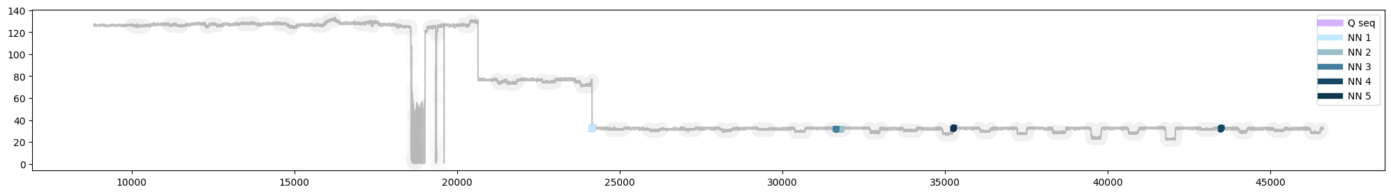
Fig 8. Plot of query subsequence (Q seq) with 5 nearest neighbours in the timeseries (MASS). Note: the query sequence (Q seq) and its nearest neighbour (NN1) are almost an exact match, and are therefore overlapping in the plot.
Spot the difference, KDB.AI vs MASS
Today, we compared two methods of pattern matching to detect anomalies in a timeseries: the traditional MASS approach and KDB.AI’s similarity search. Now it’s time to tally up the score.
In this simple pattern match analysis, both methods detected four anomalous patterns in the timeseries dataset that matched the query sequence. Yet, beneath the surface, MASS and KDB.AI approach this analysis differently, which has implications for their application.
Functionality
MASS performs pattern matching analyses by computing the distances between different subsequences in a timeseries. You can either compare a known anomalous sequence like we’ve done here, or you compute a matrix profile where each subsequence is compared to every other subsequence in the timeseries. This enables researchers to detect anomalies or repeated motifs in the data without any prior knowledge.
KDB.AI works by calculating the similarity of a given query vector to subsequences (or windows) which are stored in the database. In contrast to the linear, stepwise comparison employed by MASS, KDB.AI’s similarity search enables users to be creative. By modifying the timeseries windows, anomaly detection across multiple different data sources is a simple extension to the approach demonstrated here.
Speed
In terms of speed, both MASS and KDB.AI ran the analysis in a short time, although additional preparation steps were required for the KDB.AI analysis. However, if we shift our gaze away from simple applications, and to the world of big data, KDB.AI presents a neat solution for timeseries analysis, at scale. With its roots in KX, the developers of KDB+, KDB.AI can integrate with real-time applications, built on vectorised systems, enabling lightning-fast analytics capabilities. Likewise, indexing methods (like HNSW) promise minimal latency with increased data loads. Although KDB.AI does lack some of the nifty “plug-and-play” features of traditional approaches, it shares their core functionality, which can be developed to yield sound insights into timeseries data.
Today we’ve seen that at its most basic, KDB.AI can go toe-to-toe with existing methods of anomaly detection, using a simple pattern matching approach. Next in our series, we will showcase creative ways to leverage this functionality for the analysis of financial market data trends.
Share this: