Deploying Pulse Visualisation with TimescaleDB
Liam McGee
Introduction
In a previous blog post, we explored TimescaleDB and looked at some of its features designed for handling time series data. One of the standout advantages of this database is its ability to significantly simplify and improve data analysis compared to the traditional PostgreSQL database upon which it is built.
However, both PostgreSQL and TimescaleDB lack a crucial feature for data analysis – the ability to visualise data. Data visualisation can play an important role in analysis, especially when working with financial time series data. It offers users quick and easy insights, real-time monitoring, and the ability to explain trends and patterns to non-experts. Ultimately, it provides a clearer picture of the data’s dynamics.
This is where we can use Pulse, a visualisation tool built by the team at Timestored with front office capital markets trading use cases in mind, but with applicability beyond that. Pulse serves as an external tool that can be easily connected to a TimescaleDB database, offering real-time data visualisation capabilities. It achieves this by establishing a connection to a database and executing user-specified queries, presenting the query results in various formats. The key advantage of Pulse lies in its full customisation, allowing users to utilise multiple components to query different tables within the database as per their requirements.
In this blog, we will provide an introductory guide to setting up Pulse and establishing a connection to a TimescaleDB database, demonstrating some of the available visualisations applicable to the data we utilised with TimescaleDB previously. Pulse does support visualisation for various other database types, including kdb+, MySQL, PostgreSQL and more. While the focus of this blog will be on TimescaleDB, the process for connecting to other database types is very similar.
Creating a Connection
When getting started with Pulse, the first step is to establish a connection, which grants you the ability to send queries to your database. To do this, navigate to the “Connections” tab located in the top left corner. On this page you’ll find a list of all existing connections, providing options to manage, edit, or delete them. Additionally, creating a new connection is straightforward – just click the “Connect Data” button.
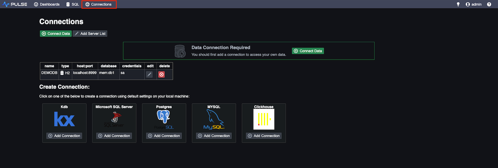
In this section, you can input your database’s connection details and assign a descriptive name to easily identify the connection when needed. One important point to note here is that if you’re connecting from a different server, your database should be accessible to external connections. This may require your database to run on a specific port range to facilitate the connection.
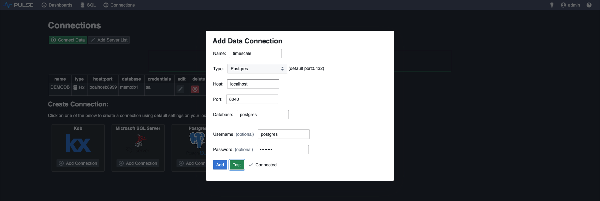
Once you have entered the connection details, test the connection to check that it has successfully connected to your database. If so, you can add it to your list of connections.
Creating a Dashboard
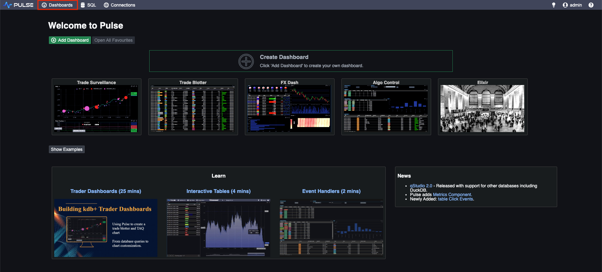
Now that you have successfully connected to your database, you can begin to visualise your data by creating a dashboard. To create a dashboard, simply go to the “Dashboards” tab, where you’ll find a list of all existing dashboards. By default, some demo dashboards will be available, showcasing examples of the dashboards that can be generated using Pulse. These demo dashboards are generated from a demo database and can be a useful resource to explore and gain insights into the types of dashboards that can be created using Pulse.
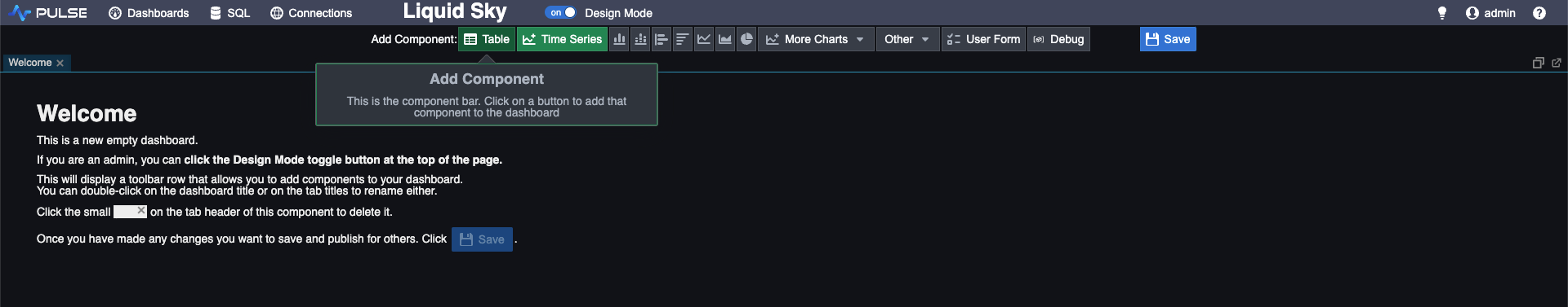
To create your personalised dashboard, begin by choosing “Create Dashboard.” This will take you to a blank dashboard where you can add your desired components. To add a component, simply select “Add Component” and choose the type you prefer. Keep in mind that you can always change the type later, so the initial choice is not so important.
Once you’ve chosen the component type, you’ll now need to populate that component with data. This is done using the component editor located on the right-hand side of the app. The first step is to select the connection you have created earlier, which determines the database to which your query will be sent. One of the advantageous features of Pulse is that you can select a unique connection for each component, allowing you to create visualisations for multiple different databases together in same dashboard.
Next, you can set a refresh interval to determine how frequently the component data will be updated. Most connection types will work in a request-response manner, with the requests being sent on the specified interval timer. One exception to this is the kdb+ streaming subscription which can receive live updates in real time.
Finally, we need to define the actual query that will return the data used for that component. Different component types will require different query results. For instance, a time series graph expects a single column of type time or timestamp. Any additional columns will be plotted as time series data corresponding to those times. Entering a query that retrieves this specific information, such as selecting time and price for a particular symbol from our trade table, will then plot this price as a time series chart.
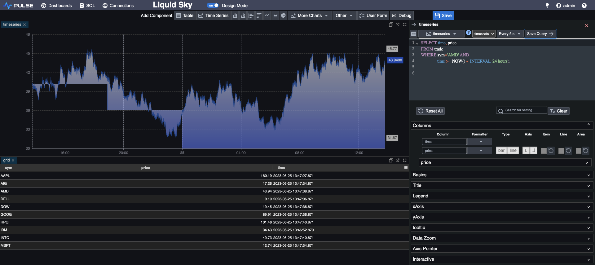
Here we have added two separate components. A grid showing the latest trade for each symbol, and a time series graph showing the price for AMD over the last 24 hours. We can format these components later to make them look more presentable and also to make them more interactive but for now we can save our progress using the ‘save’ button above the editor.
Pulse provides a wide range of visualisation components, including bar charts, grids, pie charts etc. It is easy to experiment with these which can be useful to see which component type can visualise your data most effectively.
Formatting
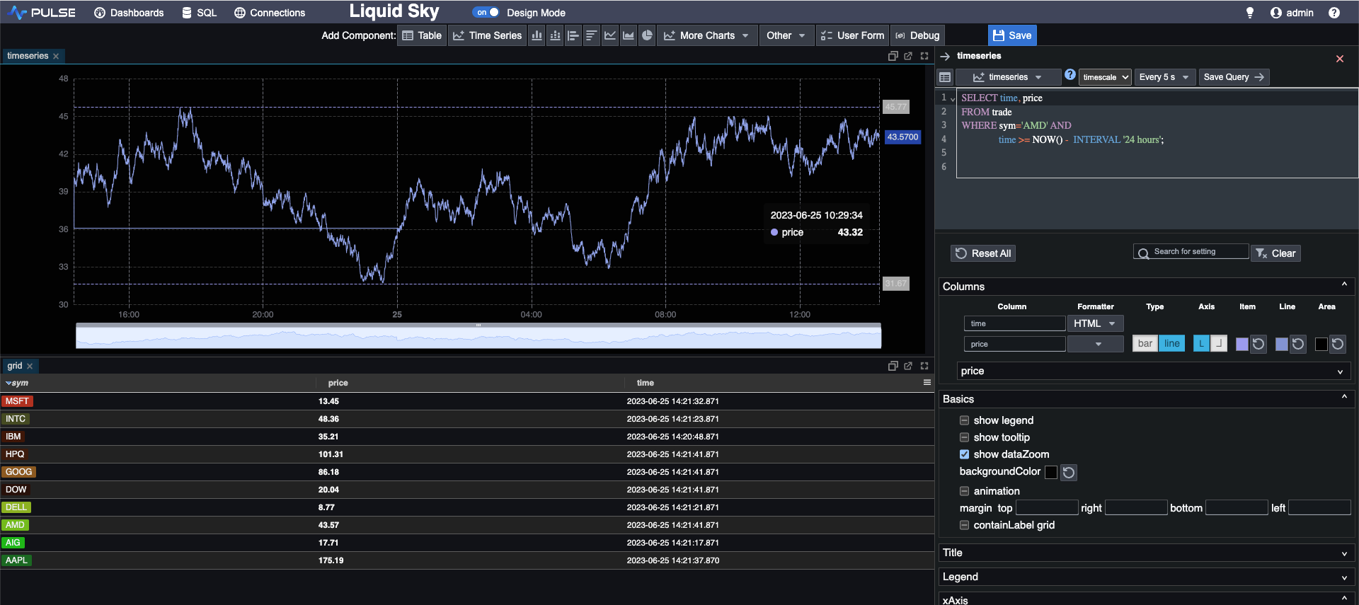
After creating a component, Pulse allows us to easily customise it using a variety of formatting options. These options enable us to highlight specific metrics and enhance the readability and clarity of our dashboard.
Many of the formatting options can be found in the component editor, located beneath the query input area. Here, we can modify colors, font sizes, labels, and other basic formatting aspects. Additionally, we have the option to use tags that apply various background colors to highlight distinct values. This is particularly useful for our symbol column as it enables easy differentiation between different instruments.
There are also some more advanced formatting options available and these are typically applied using the query itself. This involves adding an additional column to our data that will take a similar name to the column we want to format. The name will typically be the same as the original column with an added postfix dependent on the type of formatting you want to add.
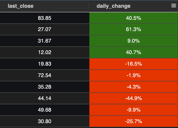
The values in this column will then determine the formatting applied to the corresponding value on the original column. This allows for greater control and customisation. As an example, you might want a column to have a green background for values above a certain threshold and red background for values under some threshold. To do this you can create another column that takes the values “GREEN“ and “RED“ in the required positions using an SQL CASE expression. This column just needs to have the same name as the original with an added postfix “_SD_BG“.
There are many other options available that are implemented in the same way including text colours, digit highlighting, status flags and data bars.
Using TimescaleDB Continuous Aggregates
At times, we may want to display metrics that are not readily available in our existing tables and require some number of calculations. These calculations would then be performed with each refresh, potentially leading to repetitive computations on older data.
This is where we can leverage the combination of Pulse with TimescaleDB continuous aggregates. We explored continuous aggregates more extensively in a previous blog post, but in short, they enable us to calculate and store query results in a separate object. Moreover, they can be set to refresh on a timer, recalculating results only for newer data, while assuming that older results remain unchanged.
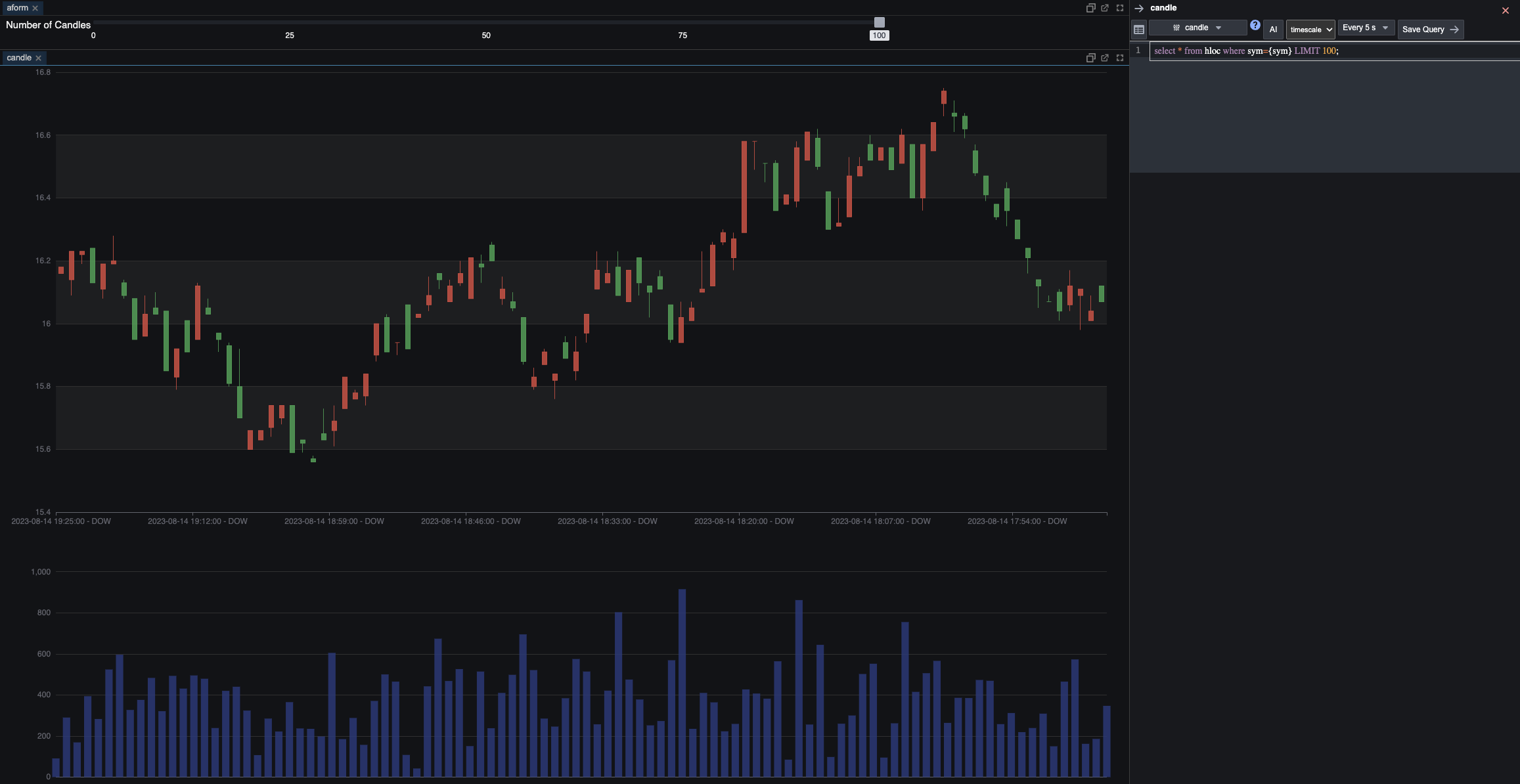
Lets say we want to display high, low, open, close (HLOC) using the pulse candlestick component – we can first create a continuous aggregate on TimescaleDB. This allows us to store the pre-calculated HLOC information, and then we can directly query this object from Pulse. By doing so, we avoid unnecessary recalculation of older candlesticks when the results remain the same, making our visualisation process more efficient and seamless.
Interactive components
Another useful ability of Pulse is the capability to make certain components interactive. This improves the efficiency of the dashboard, allowing users to select the information they want to see. With this flexibility, not all data needs to be constantly on display. Moreover, users can adapt their dashboards to accommodate changing circumstances, allowing for a dynamic and user-friendly experience.
One way this is done in pulse is through user forms – these are additional components which allow a user to specify certain values that will be used in other components or queries. There are a number of different types including check boxes, sliders, date pickers etc. To add a form we simply add a component, select the type and give it a label and a unique key. In our case we want to add a checkbox component that will allow us to select which instruments we want to display on our summary grid.
There are two ways we can specify the values of the checkboxes, either by writing a hard coded list or by using an SQL query. The SQL query will take values from our database and will refresh on a timer so that these values are kept up to date. This method is generally better practice when possible as it will ensure no values are missed and any new values will be automatically included. In our case, we want a checkbox for each symbol, so we write an SQL query that will return a list of all distinct symbols from our table. These will be used for our check boxes.
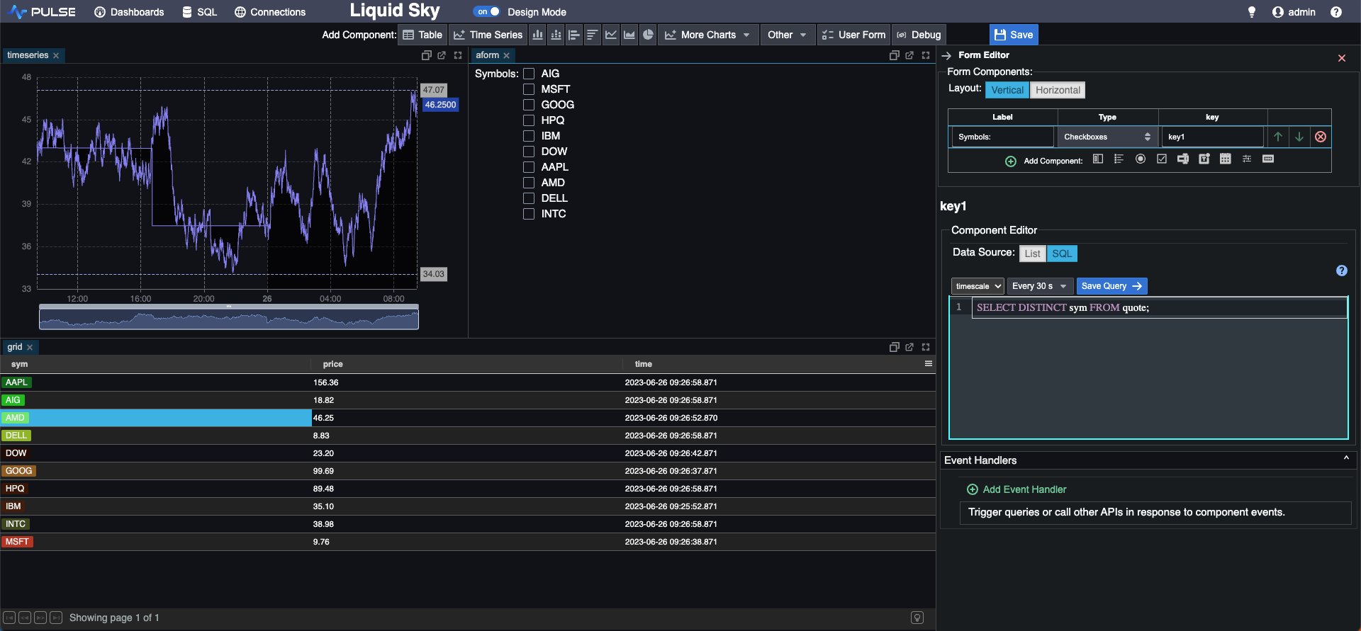
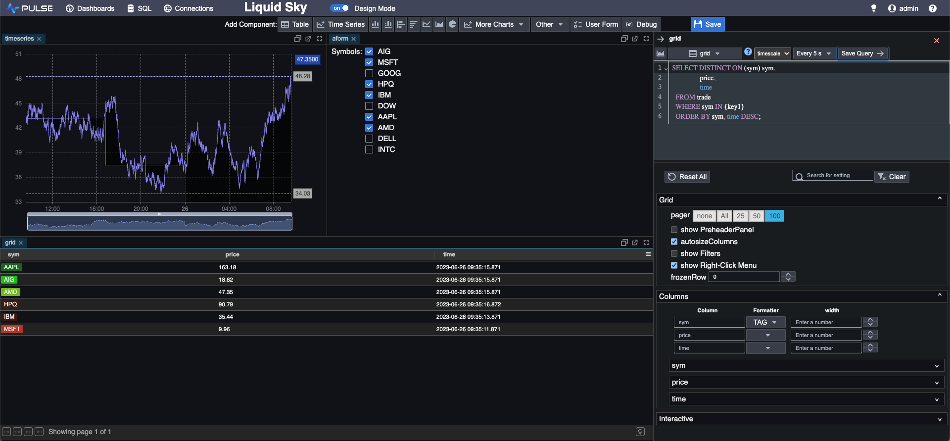
Now that we have the form created we need to update the original query for the grid. First take note of the key for our check boxes form which is ‘key1’. Using {key1} in any query will now return a list of those symbols that have been checked in our form, so we can update the query to only show those symbols that have been checked.
Other user form components will work in a similar way, you just need to make sure to refer to the key name inside `{}` brackets. For example, we can add a slider component to adjust the number of candles shown in our candlestick chart from before. We can also add a date picker that will allow us to show the price history for a particular date on our time series component.
Pulse also allows us to make existing components interactive through click events. Each component on our dashboard will have keys with associated values that will be updated by clicking on them. We can view the names of these and how they update using a specialised debug component.
As an example we can use the `sym` key, which takes the value of the symbol of whichever row we click on from our summary grid. Our timeseries chart currently shows the price for AMD. We can update part of this query from `WHERE sym=’AMD’` to `WHERE sym={sym}` and now whenever we click on a row from our grid, the time series graph will update to show that instrument’s price over the last 24 hours.
Conclusion
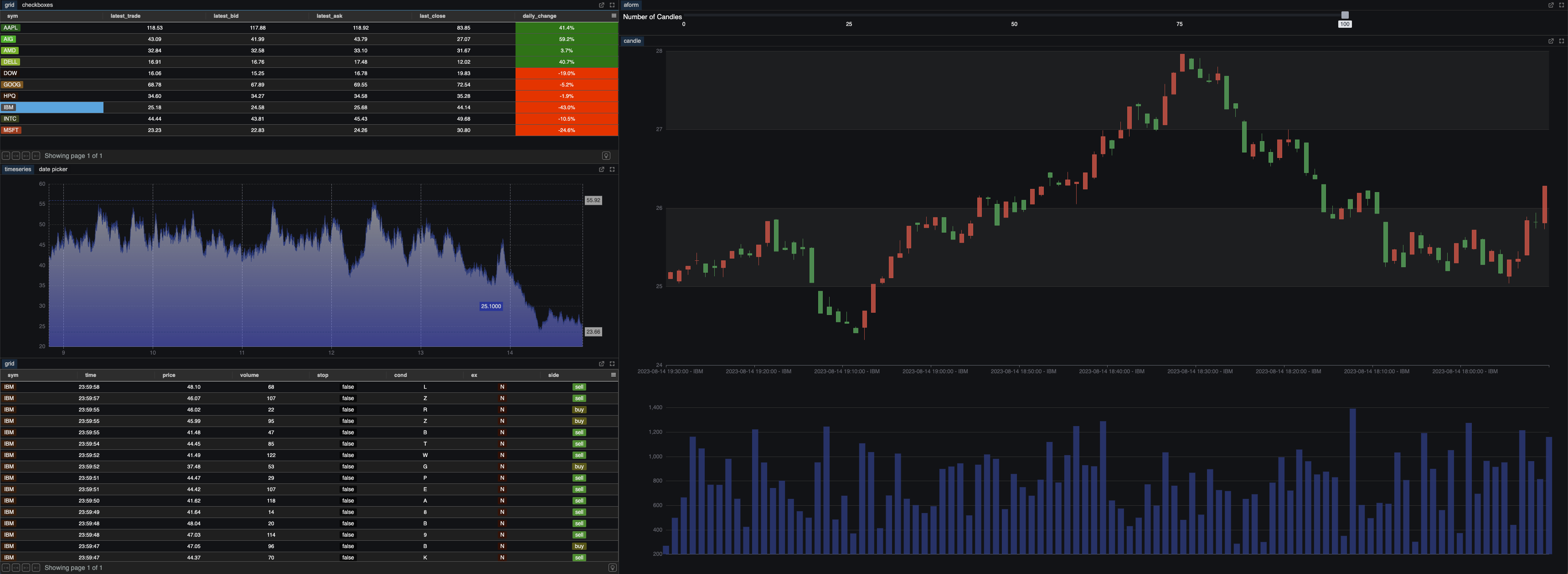
In conclusion, Pulse proves to be a very useful and versatile visualisation tool that enables the creation of customisable and interactive dashboards. We have been able to easily create the above dashboard which displays all relevant information from our TimescaleDB database – this ability to create effective dashboards easily and intuitively stands as the biggest advantage of Pulse over other visualisation tools.
The dashboard includes a grid with latest price, quotes and daily change for each instrument updated to the latest second. We also have control over which symbols are shown, and clicking on any row of this grid will update the rest of the dashboard to be specific to that instrument. These components include a historic time series chart for which we can select the particular date to show. We also have a live candlestick component that will update on a 5 second interval, showing the high, low, open, close and volume for each of these intervals.
This dashboard allows us to have a clear and concise overview of all instruments, while also allowing us to focus in on specific instruments giving us a real time and historical view of their prices.
There are also many other features available that we have not utilised in this dashboard. For additional customisation we have the option to use html and spark lines. Event handlers allow for even more interactivity with the dashboard, allowing users to run specific SQL queries directly from the dashboard.
One of the newer features is the integration of AI to generate queries, highlighting Pulse’s commitment to enhancing user convenience. This innovative addition can streamline the dashboard creation process, improving its ease of use. Pulse has generally stood out for its responsive development team, actively addressing issues and consistently improving the product. This ensures that users can count on an evolving tool that not only simplifies dashboard creation but also adapts to our evolving needs.
Share this: