As You Bike It: Mapping Belfast Bike Usage
Ryan McCarron
We recently noted the ability to use our TorQ package to collect data on our local Belfast Bikes transport network. So how does our cycle network look after collecting for a while?
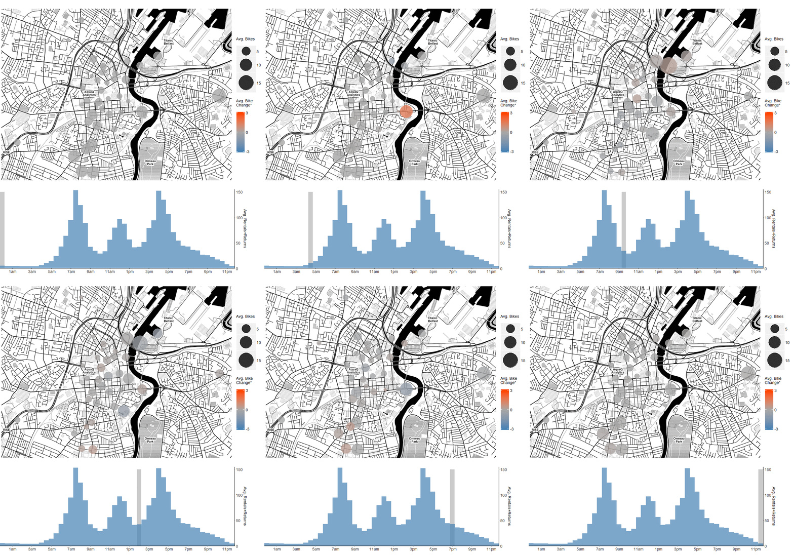
We recorded data on the status of each station in the network for 6 months, and we can now use this data to observe how the population of bike stations evolves over the course of an average Belfast day. We averaged the counts of bikes at each station over each weekday into 30 minute buckets. Each bucket represents that half-hour for all days in the full data set. The animation above illustrates this; the spots are bike stations, and the size of the spot is the average population at that time of day. The colours of the spots are the change in bike count within that 30 minute window, from the last window. Above you can see blue stations are shrinking, red stations are growing.
The lower chart is the total rentals in the network – bikes taken from any station or returned to any station within the 30 minute window are counted here. As you might expect, there’s very little activity until around 5am, at which point we can see bikes (and, presumably, people) arriving at Central Station. As rush hour starts, the outer stations empty, especially noticeable in South Belfast. Meanwhile, stations in the centre of the city and the docks fill up, particularly Corporation Square, Gasworks and Odyssey stations, which are areas largely dominated by office buildings.
Around lunchtime we see another activity spike – a further concentration into the very centre of the city. We can assume Chichester St. and Castle Place are obviously prime lunch zones. This concentration relaxes a little back to the pre-lunch state, and in the late afternoon, the morning process reverses; the busy stations in the centre empty into the quieter stations further out. The exception here is Central Station, which is again very busy. Let’s look at these in a little more detail:
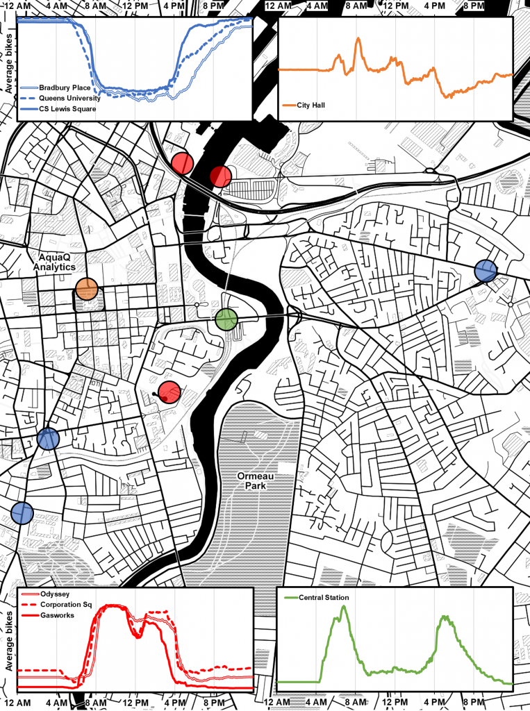
These are the average counts of bikes in 2 minute buckets for each station. Here we’ve broken down stations into a few clear archetypes: Bradbury Place, Queen’s University and CS Lewis Square are “source” stations. They start full in the morning, and empty during the day. These overlap very neatly with the “destination” stations, Odyssey, Corporation Sq. and Gasworks.
Central Station and City Hall are a little more unusual. Central clearly serves the rail commuter traffic – note the evening spike between 4:15pm and 4:30pm – while 6 trains arrive and depart at Central. The rise and fall of bikes in this station is from commuters arriving and leaving bikes early enough to get to work, then the same bikes being taken immediately to other stations by other commuters slightly later as arrive to work in the City Centre. City Hall serves commuters, more commuters, people in for lunch and people slowly creeping home or going out for the evening.
There are some broader trends visible in Belfast Bike users. They’re extremely popular for lunchtime travel – activity is nearly as prominent as travelling to and from work. As well, people get to work around the same time (8am), but seem to creep home slowly. This is a mixture of going home at different times on different days (people seem to go home a little earlier on Mondays and Fridays) and presumably people working late more often than they arrive early.
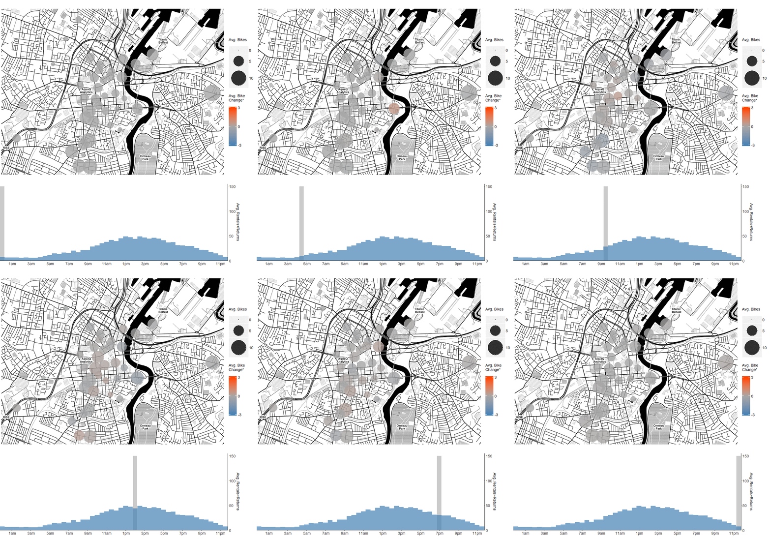
Let’s look at one more animation – it’s the same as the one at the top, but for weekends over the same period, shown below:
You can see above that people still go to Central Station in the mornings. People take the bikes into the city centre in the morning and home in the evenings (generally), but there’s a lot of noise. See if you can spot any patterns yourself, either above or after capturing some data with our TorQ package! We created the charts in this post from data captured in kdb+ framework TorQ and processed using ggplot in R. Maps from stamen.
Share this:

