Stale Data: Measuring What Isn’t There
Stephen Barr

When is a live feed not live?
In October 2014, NYSE Trade data did something unusual. It stopped. For nearly thirty minutes, the live trade (and quote) data relied on by countless global financial institutions was stuck at 1:07 pm ET. During this time, any trading systems or risk evaluation systems depending on this data would produce incorrect views of the market. Any trades executed on these views would have been wrong, particularly for stocks trading on other exchanges.
How do you tell when something that should be there, isn’t? How do you tell when your data is out of date? This issue was on NYSE, but all data feeds do two things: deliver data, and fail to deliver data. No system is perfect. So let’s establish a basic check to do one simple thing: tell us how likely it is that our data feed is broken, and that our latest data view is stale. There are two ways to think about this problem.
Time


Detect where the data has stopped flowing to the consumer or if the data is arriving late – put simply, no data.
Quality
If rows are coming in, are they correct? Are they different to what was there before? Or are we just seeing duplicates?
What's the solution?
First: we’re going to focus on the time aspect for this post – we’ll look at quality in a follow up.
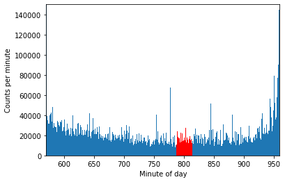
Understanding whether data should be there seems tricky on the surface. The first step is always to establish a picture of what is normal. How frequently does the data arrive? We’ll use the NYSE trade example above. In this example we’re working with a sample from 1st April 2022 – not quite the same dataset, but similar. We’re using Polars, and we’ve converted the raw csv into a lazy-loaded parquet file for efficiency. We’ll filter the data down to just the relevant window.
So how many rows of trade data came in between 13:07 and 13:34? Around 3.5 million. What does this data look like? Effectively, nothing. You can see it in red on the image; compared to the rest of the day, this time is fairly unremarkable. We won’t exhaustively plumb the depths of time ranges, but this segment of the day looks the same as any other when the market is open – noisy, and prone to day-to-day variance. A given minute here is less active than a minute near market close (generally), but other than that there isn’t much to say. When looking for stale data, we could suggest some arbitrary counts (e.g. 1000/minute) which would tell us something is wrong if we passed a minute without data. But in this space, a minute is a long time. We can do better.
Poisson Please
We need an effective method of thinking about the processes by which market data feeds deliver data. What are some of the features of this data? More specifically, if we only care about the time distribution, what does that look like?
- Events are roughly independent – lots of data all at once doesn’t seem to have a bearing on data immediately after
- We can get batches of rows at the same time
- Broadly, events are relatively evenly distributed throughout the day (with a spike at close)
The model we’ll use for this process is a Poisson process. What do they look like? Poisson processes are effectively timed randomness. For a given rate of occurrence, a Possion distribution tells us how likely we are to see a certain amount of events in a time window. Examples of Poisson processes include people visiting websites, radionuclear decay (how many atoms decide to decay in a given time window), and rain drops falling into a bucket. Each of these has a “rate” – say, number of raindrops per second. The distribution will simply tell us that if we have a rate of 10 drops per second, how likely it is in an interval of 5 seconds to see 0, 1, 2, 3,.. etc events. Poisson processes have events which are:
- Independent – one occurring doesn’t impact the occurrence of another
- Singular – events happen one at a time
- On average, constant in time
If we don’t distinguish between a batch of data and a single row of data (i.e. only look at distinct time stamps) this trade data becomes a pretty close match to the Poisson description. Importantly this model gives us a way of thinking about the timing of events, and specifically how likely a time gap is between successive events.
The distribution itself is useful, but for this exercise we can jump straight to the most useful result – the probability that, given a certain rate of messages, you’ll have to wait more than a certain length of time.

Exponent moment
This is a classic exponential relationship. All this says is, for a given rate (events/time), in a time period t, what are the chances you have to wait some time T (which is longer than t) before seeing another event? For example, in the raindrops example above – lets say our rain-catcher sees 5 drops per second. What are the chances we have to wait at least one second between drops? Plugging in the values to this formula, we get a 0.6% chance. The chances we have to wait longer than 0.1 seconds are much higher – 60%. This makes sense! With 5 drops every second, you’d expect to wait more than 0.1s on average.
We can apply this exact principle to the NYSE trade data. But first let’s check to make sure the model is close to reality. The loaded data table looks like the below.
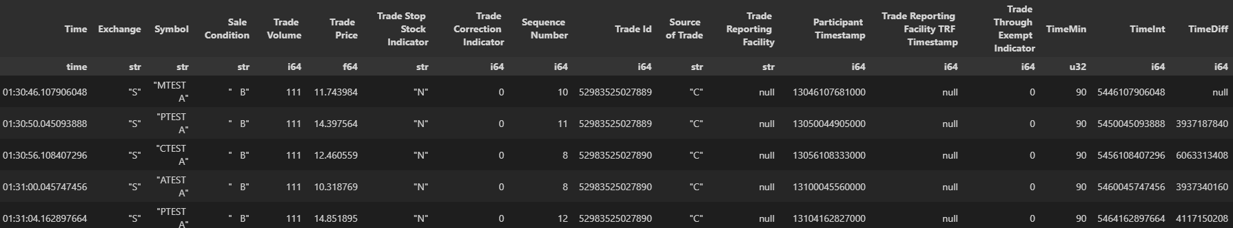
The goal here is to determine if the exponential model above describes the data well, but first some more tidying and filtering. On top of the raw data above, we’ve added TimeMin (the time to the nearest minute of the day), TimeInt (time as a nanosecond integer) and TimeDiff (nanosecond differences), all for convenience. We only care about determining if data is stale, and we want to avoid counting “batches” that arrive together, so let’s filter for both of these by restricting ourselves, in a given window, to time differences in the 95th percentile and above. We care more about the outliers than the “standard” picture when determining if data is stale. Some degree of late arrival (or long delay) is expected, and we only want to identify the data state as stale if the current time delay is an outlier even among outliers.
The next processing step is to filter the data into bins. By effectively building a histogram, we can get a picture of the average probability of a wait of at least a certain threshold. After binning, we can normalise the data – we know that we have to wait at least as long as the smallest bucket by definition, so the probability for it should be 1. With this done, we can finally fit the exponential relationship above, and see if it accurately describes the relationship between data timings.
#get the time diffs for 13:15
timediffs = tradep.filter(pl.col('TimeMin')==13*60+15).collect()['TimeDiff']
#keep only the top 5%
timediffs = timediffs.filter(timediffs>timediffs.quantile(0.95))
#break into 50 buckets and count
width = (timediffs.max()-timediffs.min())//50
cdf = (timediffs//width*width).value_counts()
cdf = cdf.sort('TimeDiff').with_columns(pl.col('counts')/pl.col('counts').max()) #normalise
# fit exponential
expfit = np.polyfit(cdf[cdf.columns[0]],
                    np.log(cdf['counts']),
                    1,
                    w=np.sqrt(cdf['counts']))
fig, ax = plt.subplots()
ax.scatter(cdf['TimeDiff']/1e6, cdf['counts'])
ax.plot(cdf['TimeDiff']/1e6, np.exp(expfit[0]*(cdf['TimeDiff']))*np.exp(expfit[1]),'r')
plt.xlabel('Time between events (ms)')
plt.ylabel('Wait probability')
plt.ylim([-0.05,1])
print(expfit)Model vs reality
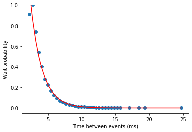
This is an excellent fit – R-squared of 0.97, implying the model captures most of the reality observable in the dataset. We see a very similar pattern across the whole day – for a given minute, with enough traffic (i.e. when the market is open), we can easily construct this model which will describe how likely it is we have to wait a certain number of milliseconds for an update. From here we can set an alert threshold based on the model – all we care about is the model fit parameters. In this case, we have 5.9e-7 and 1.45. After fitting, we can plug these back in and get a probability for any time. For example – across this minute, the probability of waiting more than 5 ms is 22%. The probability of waiting more than 20ms is 0.003%. Quite the drop-off! Note this is all single-day data, and there is some vulnerability to overfitting. A real system would extend this over a long period of stored data, finding the best fit and confidence intervals across a much broader time range and fitting/testing to that, but the basic principles wouldn’t change.
Caveat Computer
With the model in hand and seemingly very applicable, identifying stale data then becomes a matter of applying sensible probabilities. There are 7 million messages a day, 100-150k per minute during market open (more in the closing minutes). How can we safely say data is stale? We have to be careful – simply setting 99% confidence will give us lots of false positives. In reality, this is a balancing act between reliability and minimal noise. A feed as busy as NYSE trade allows us some headroom, too. We can probably stick with 1-in-a-billion as our alert threshold – we’d expect this to naturally occur, if well trained and modelled, once every few years. Monitoring the data feed, and checking how long it’s been since the last message with this probability as our threshold, we’d generate an alert 42 milliseconds after our last message. In the case of the NYSE example above, this is practically instant notification that something is wrong for most use-cases. In the example at the top of this page, NYSE switched to their backup system after 27 minutes. With an automated system calibrated on a model like this, that could have been as short as milliseconds.
Share this: